Setting up my backup system
Well … Long story short, I have currently three computers, a desktop and a laptop running Win10 and a server running Ubuntu server. And I would like all of them sync and use the server for recurrent backups in the form of compressed folders which then will be uploaded to the cloud.
The plan
[this section was written before I started setting up the system]
I am planning on using “syncting” for the synchronization part, “tar” for the generation of the backups and “aws glacier” as a cloud service.
Step 1 - Setting up the sync service
In order to sync my computers I will be using “Syncting”, which is … sort of like dropbox but instead of your files being synchronized with a cloud hosted by dropbox, they are shared among your computers.
Since I mentioned dropbox I believe it is worth to mention why I chose this particular service and not dropbox (or any other equivalent). An initial concern of mine when deciding what to chose was the storage capacity I would have, and since I am planning on having enough data to fill a hard drive in this process I did not feel that the 2gb of storage provided by dropbox would be worth it. In addition I considered using “resilio sync” or “google drive”, but gdrive does not provide a decent piece of software for linux and installing resilio is awful (ok … its not that bad but its not suuuper easy).
Now…. in order to actually set up these services…
I will be downloading the “Sync Trayzor” user interface, because I like having a gui enabled and due to the magic of chocolatey cinst synctrayzor -y does the trick.
Now I have a nice gui to configure my settings, I will be exporting my whole working (documents) and git directories.
NOTE: If you have a windows computer and you are not aware of wat chocolatey is, you should check it out, its a small pece of software that helps you install and keep up to date a lot of pieces of software.
Step 2 - Setting up recurrent backing up
There are two components for this task, the first being the actual storage of the data, and the second being how to automate its collection process.
Since this part will only happen in my linux server, then I’m just going to use the simplest thing I can think of, which is a script that compresses the folders into a huge timestamped tar file and stores it in a directory of my choosing.
And here is the script …
#!/bin/bash

# Generate a timestamp timestamp
TS=$(date +"%F")

# Name specification
BKPNAME="bkpSebastian-$TS"

# Compress
# Tar

tar --exclude-caches \
    --exclude="/home/sebastian/.*" \
    --exclude="/home/sebastian/Docker\\ Containers"\
    --exclude="/home/sebastian/Docker Containers"\
    --exclude="/home/sebastian/Dropbox" \
    --exclude="/home/sebastian/jsppUnal"\
    --exclude="/home/sebastian/perl5" \
    --exclude="/home/sebastian/R" \
    --exclude="/home/sebastian/R_libs" \
    --exclude="/home/sebastian/share" \
    --exclude="/home/sebastian/tmp" \
    --exclude="/home/sebastian/VirtualBox\ VMs" \
    --exclude="/home/sebastian/bkp*" \
    -cjv /home/sebastian
And all of this will be in acronjob for it to execute on Saturday nights (… because Saturday) .
Step 3 - Setting up the upload to the cloud
Well … So far I decided to leave this part on hold because the info is already in 3 computers so I do not really need it.
Conclusion
It all went surprinsingly smootly … the hardest part by far is automating everything and making sure thre is enough storage in all the computers.
I feel like i should be thinking about ways to make easier the management of selective sync and stuff like that, so my laptop does not need to suffer due to the load of syncing wih my desktop computer.
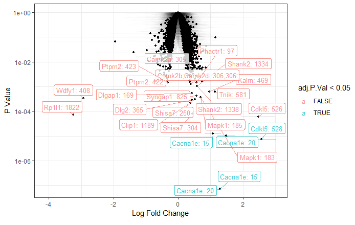 Volcano Plot Labelling a subset of relevant genes
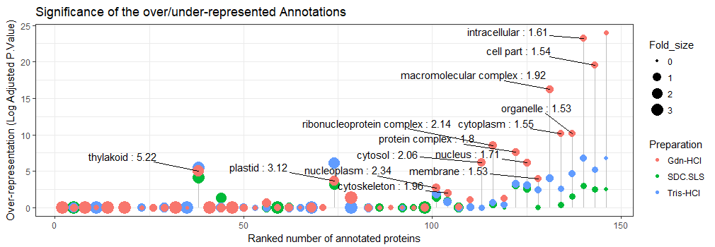 Lollipop chart showing over-represented gene ontologies product of three preparations of the same plant sample
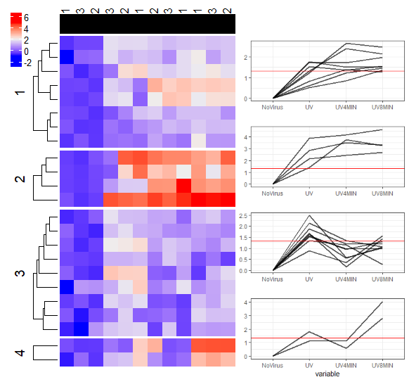 Heatmap summarising the changes with respect to a control of a subset of proteins
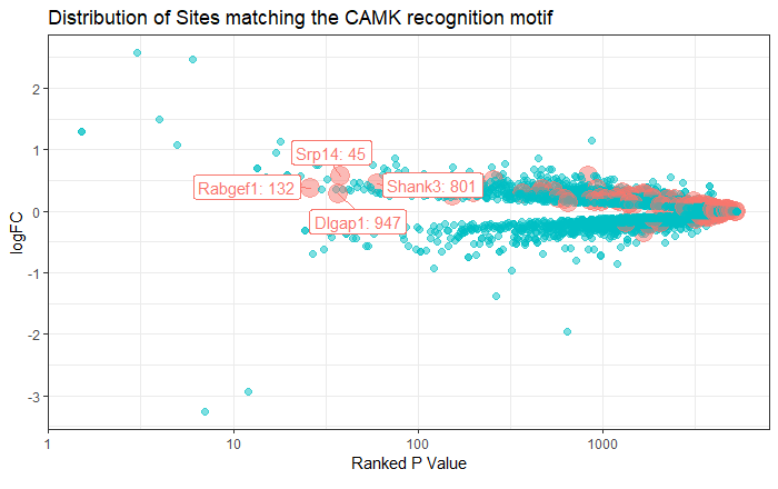 Labelled Volcano Plot
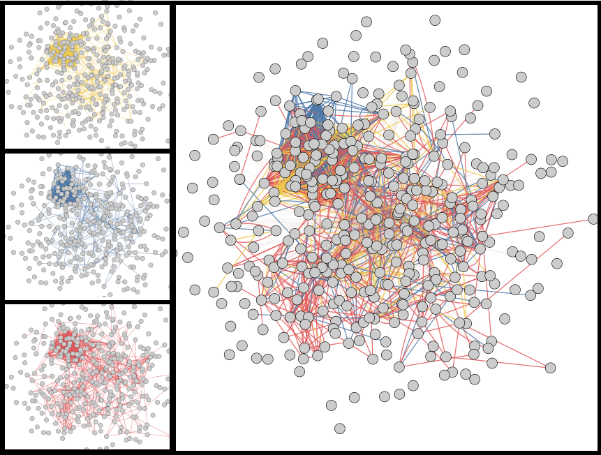 Network showing the protein-protien interactions at several time points of a proteomics experiment
